


Site : Hiroshima, Japan
Program : House
Site area : 618m2
Building area : 343m2
Total floor area : 272m2
Size : 1F - 4F
Structure : wood frame
所在地: 広島県
主要用途:住宅
敷地面積: 618m2
建築面積:343m2
延床面積: 272m2
規模: 地上1〜2階
構造形式: 木造
設計:小野寺匠吾建築設計事務所
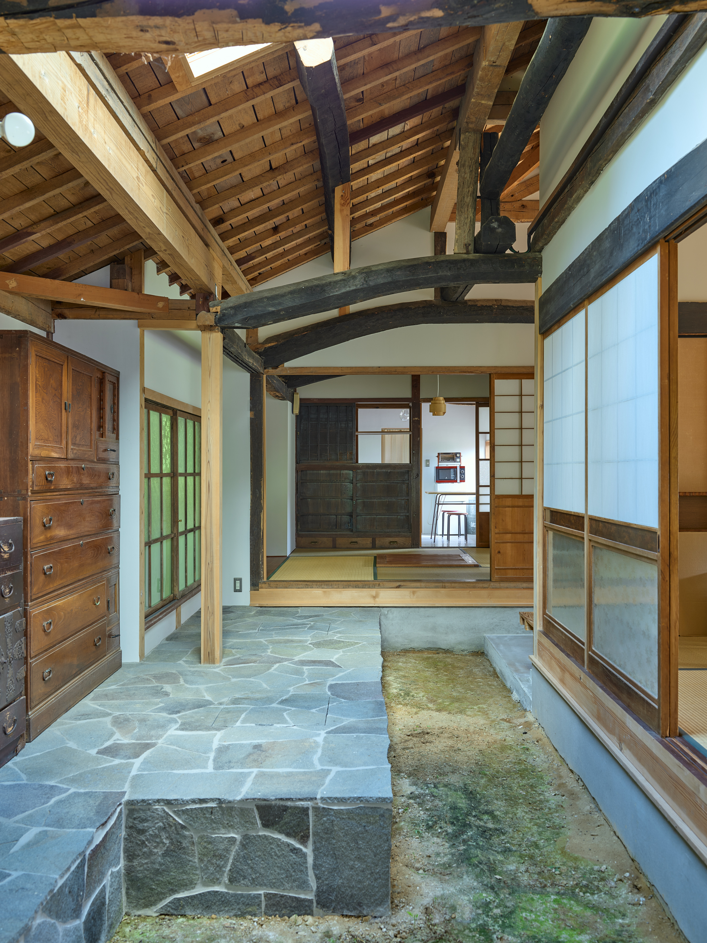
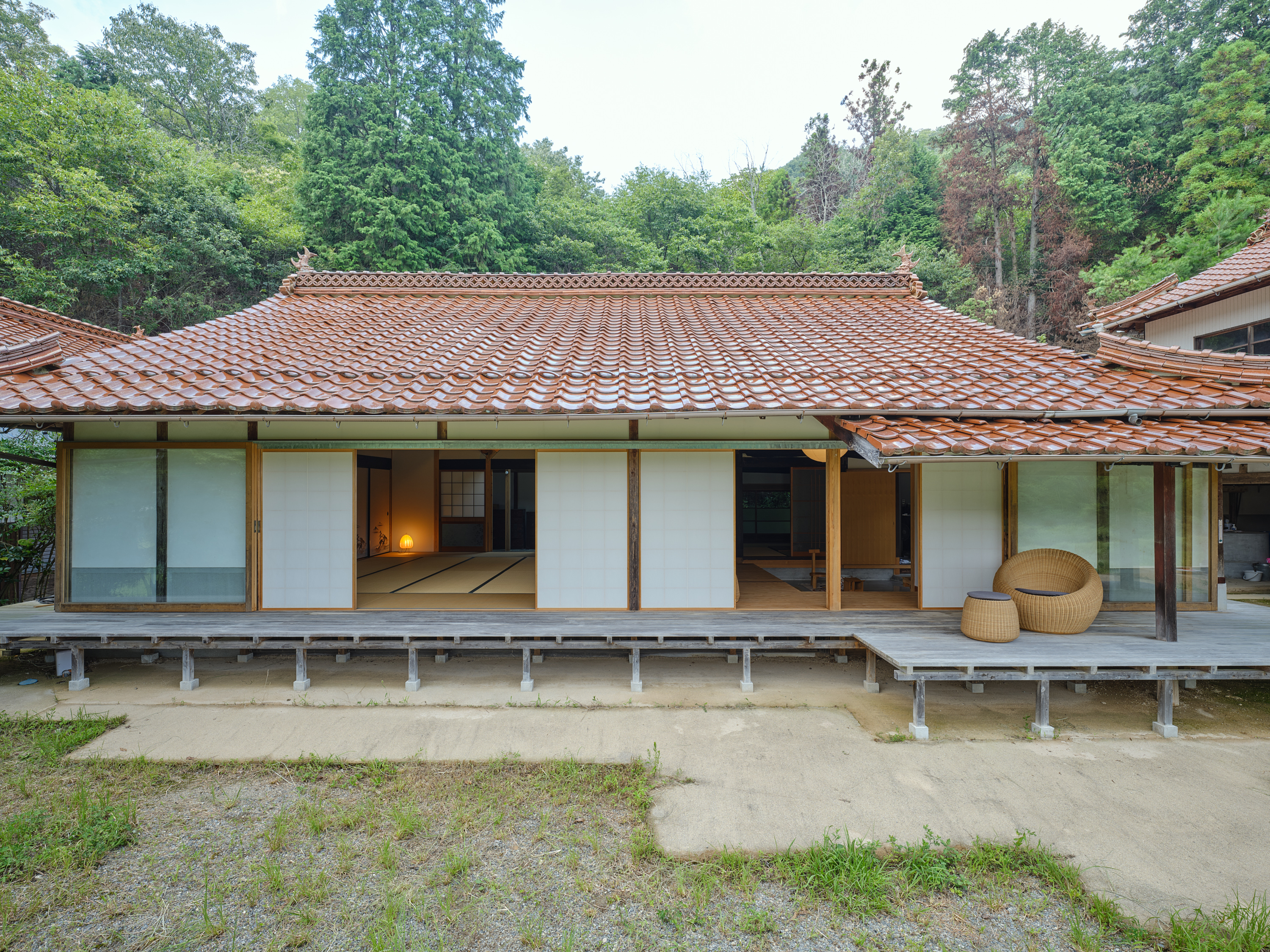
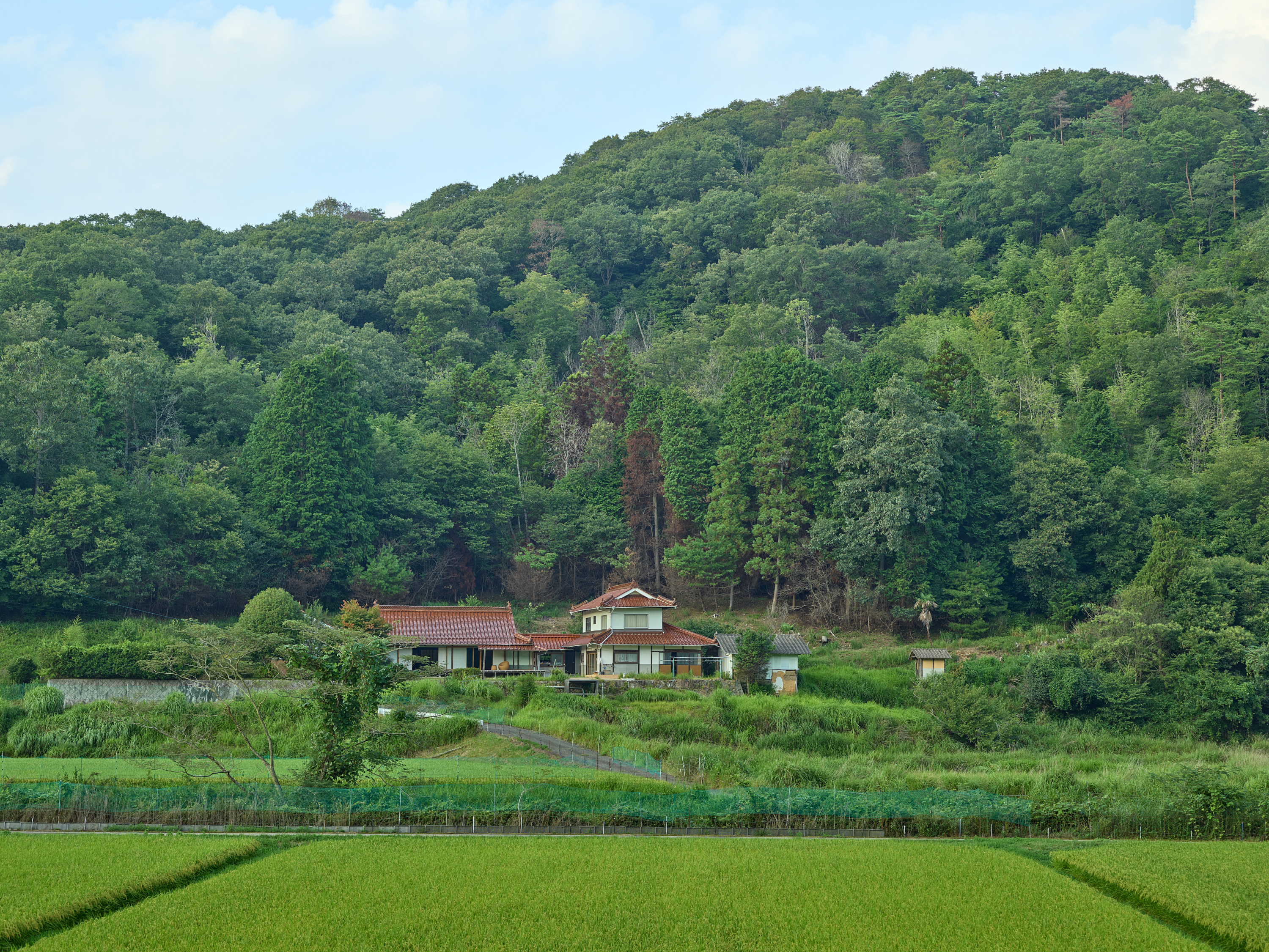
広島県三原市大和町の蔵宗という山奥にある築150年の農家形式の民家の改修である。
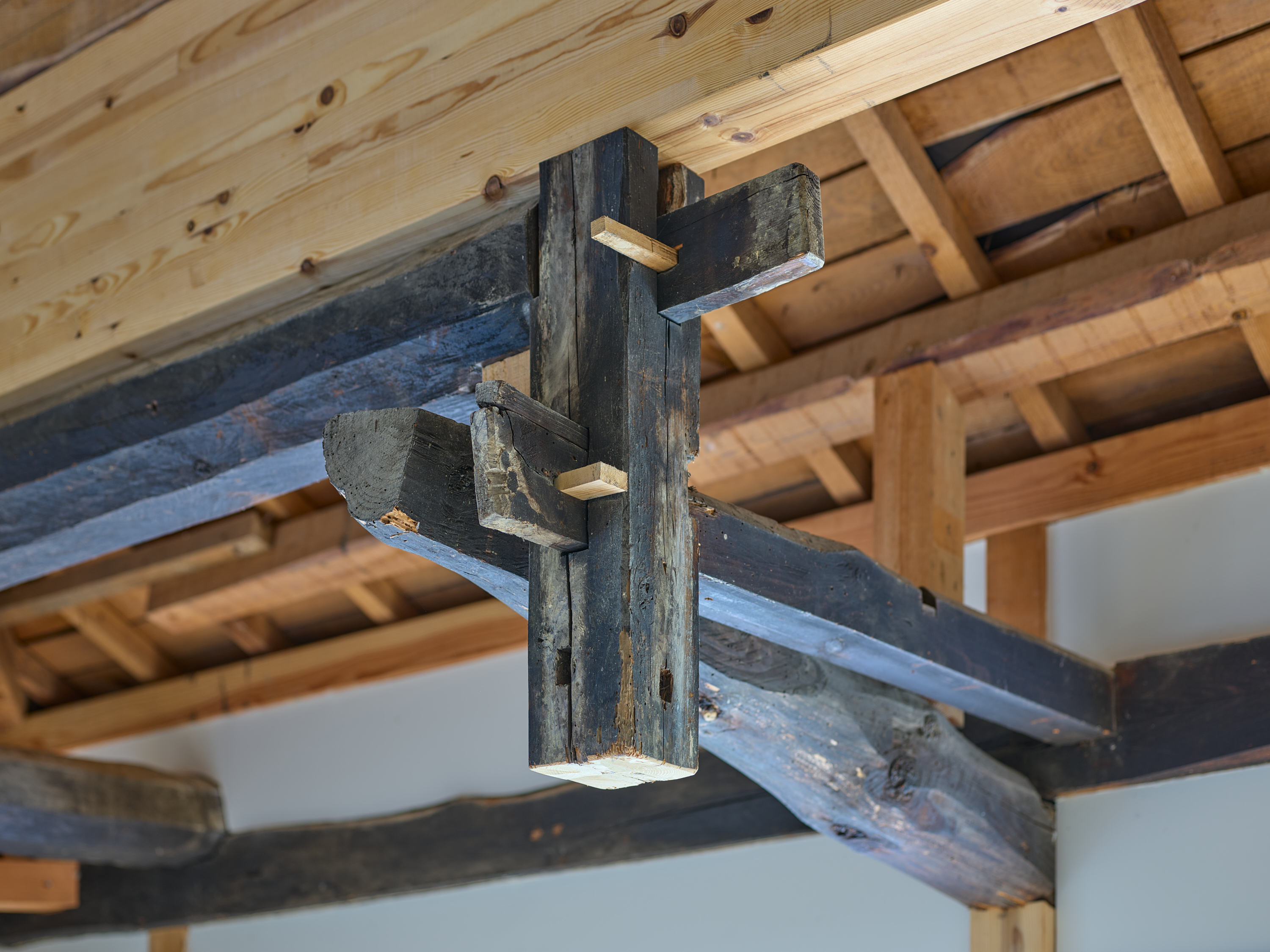
農家形式とは言っても原型が農家型であり、現在の姿は地元の大工が増改築を繰り返してきた継ぎ接ぎだらけの建築家なき建築である。
ちなみにここは、義父の実家である。つまり妻の祖父母が暮らした家である。大往生の末、近年他界してしまった祖父母の実家を残すのか、取り壊すのか、はたまた建て直すのかというところからのスタートであった。
施主は義父だが、これからこの家を使っていく妻や義妹が直接のクライアントとなる。
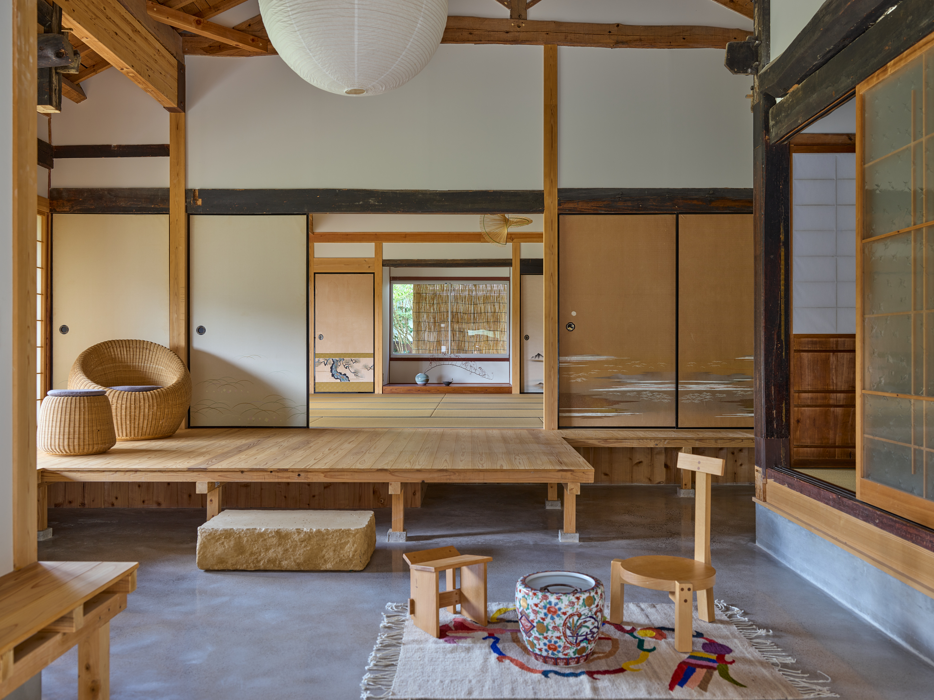
彼女たちにとっては小さい頃からの祖父母との思い出が残る家を新しい家族とともに引き継いでいきたいということ、祖父が好きであった縁側を生かしたいということ、そして天井で閉じられた暗い家は明るくしてほしいという要望があった。既存家屋は構造的根拠のない小屋組であったり、手を加えて改修すること自体、かなりの時間と労力を割くことになると考え、母屋を取り壊して新築とする前提で計画を始めたが、やはり思い出を残すという課題が、大きく引っかかることとなった。プランや形式を引き継ぐ形で新築にしたり、小屋組は残して遣り替えることだったり、使える部材のみ転用することでも思い出の引き継ぎは事実上は可能かもしれない。しかし改修においては机上理論ではなくあくまでその実体性が重要となる。この場所で祖父母が暮らしていた空気感であったり、特にその室内空間が持っている神聖さやにおいというものを再現するのは難しい。むしろ再現しようとしている時点では全く別のものを再構築しようとしていることに気がついた。都会で育つ新しい世代がこうした環境で古き良き日本の住宅を体験していくことの重要性を考えて、この150歳以上の家に丁寧に寄り添いながら「新しい使われ方」に合わせて改修するという形でプロジェクトが進むこととなった。
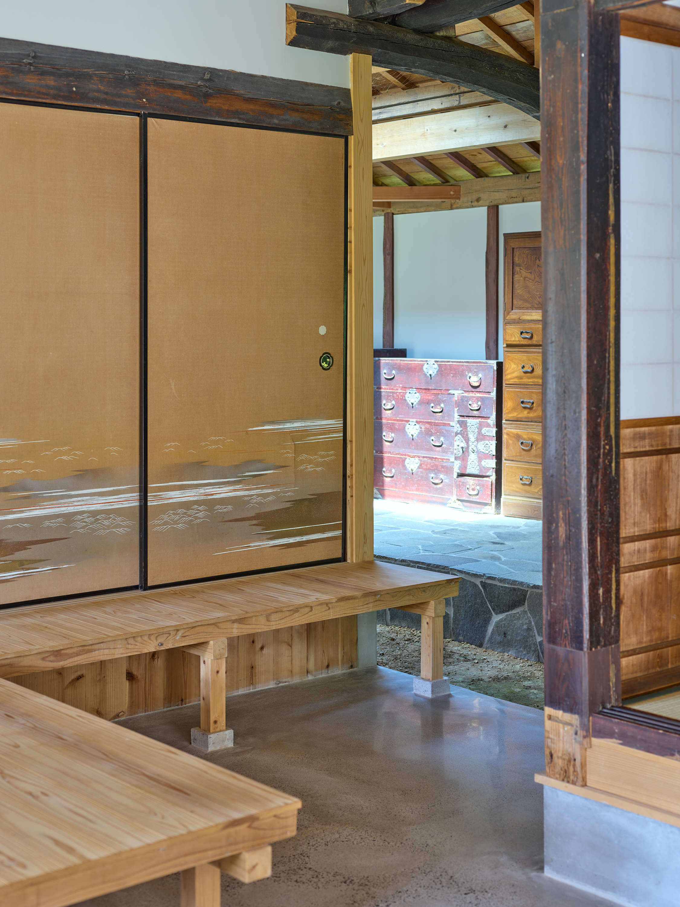
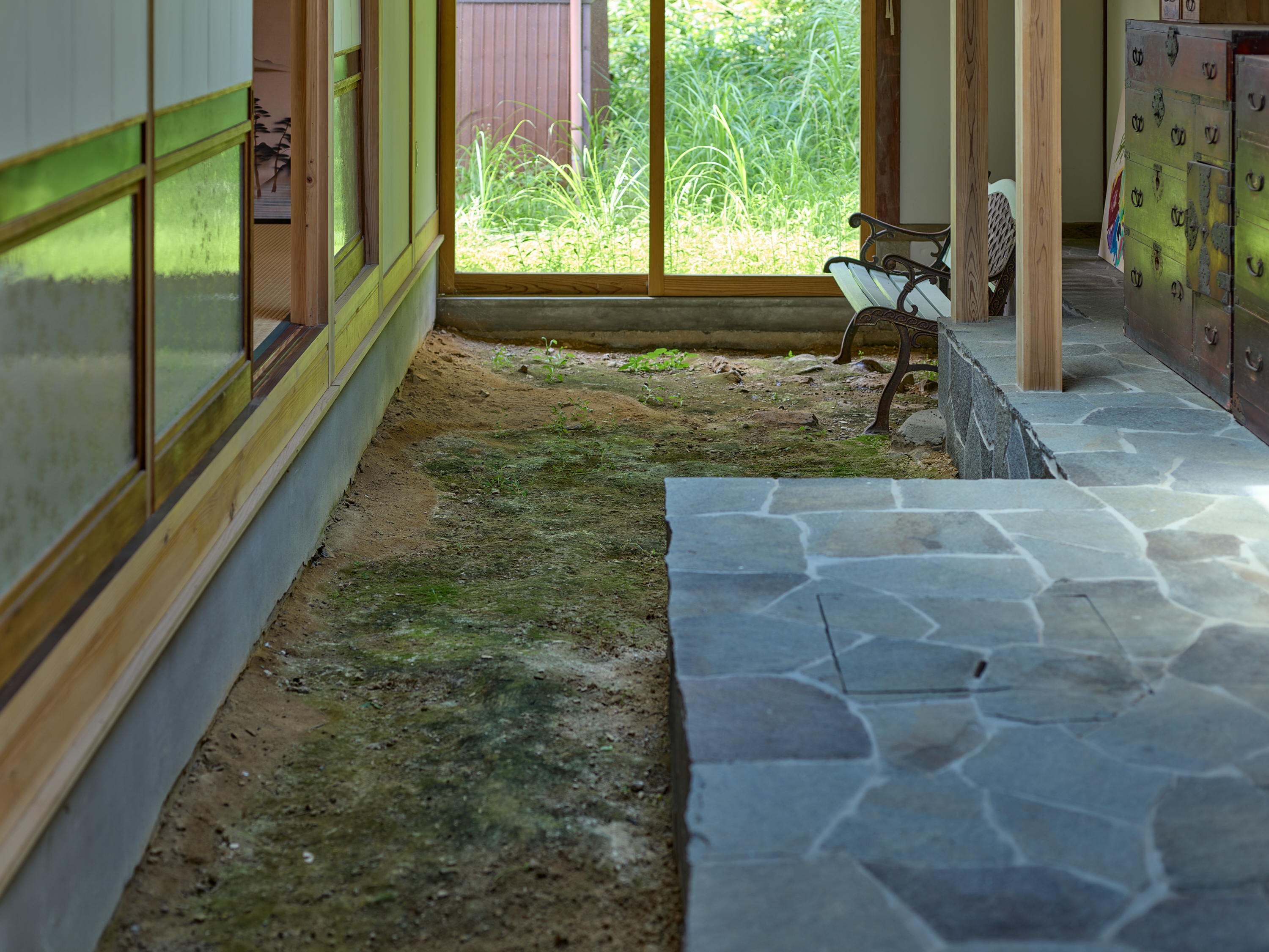
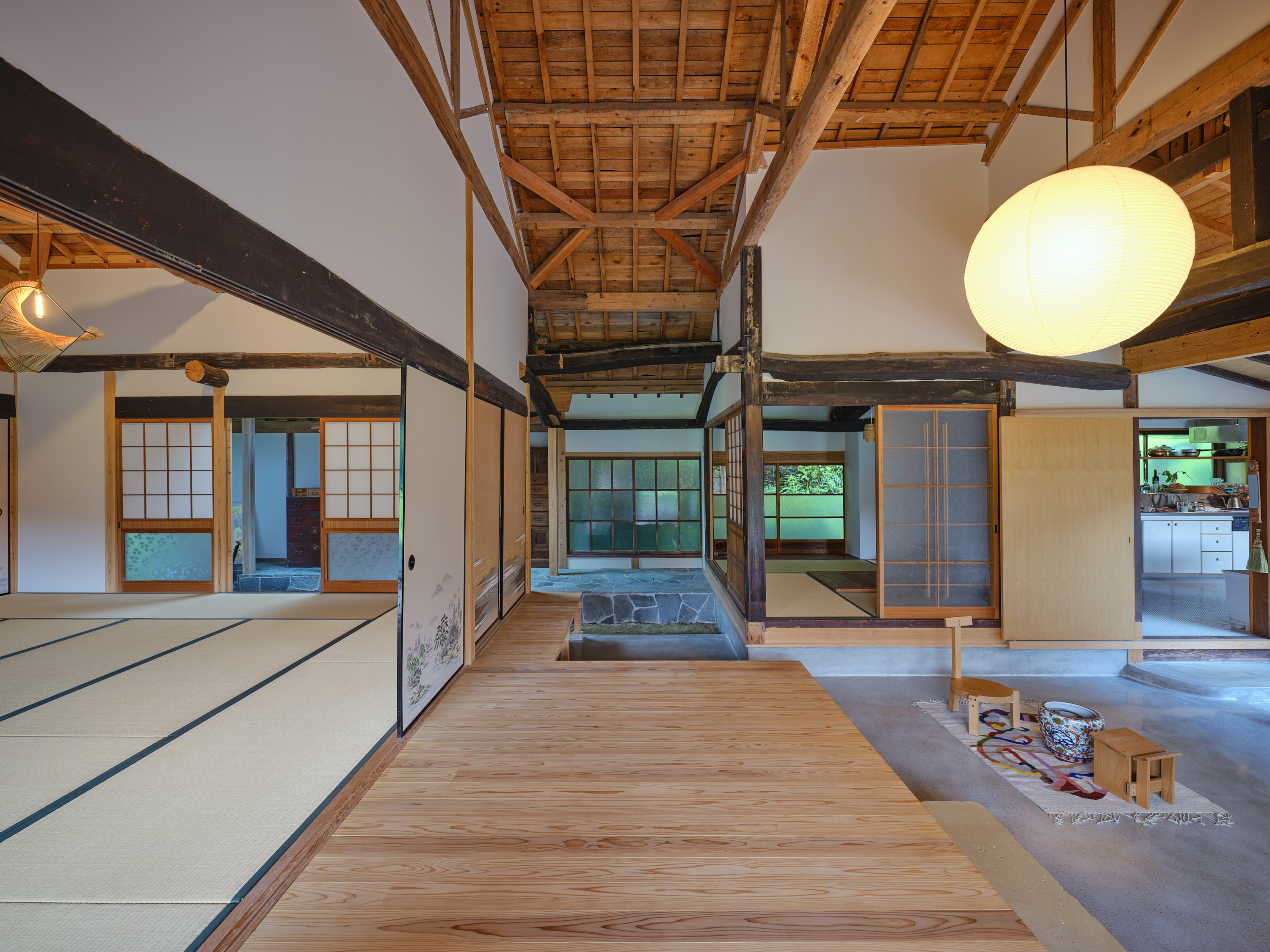
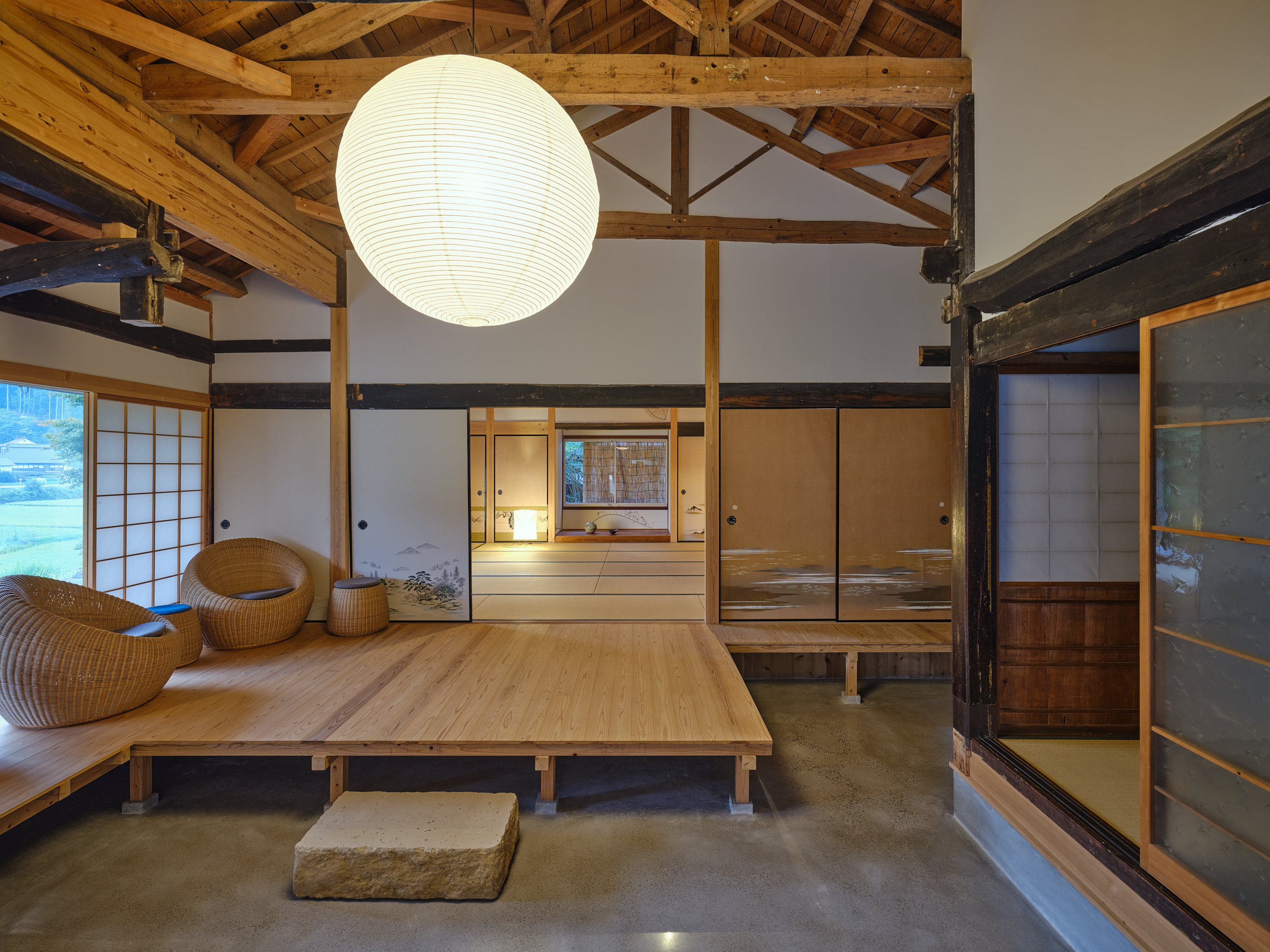
そこで、長い年月の中で増改築が繰り返されてきた軸組(工法的にも寸法的にも根拠のない)を改めて眺めていると、母屋だけでなく、使わなくなった納屋や蔵との連続性や農家的な動線を感じるようになった。そう、もともとここは農家なのである。外部から連続するように三和土(タタキ)は台所まで締め固められていた。納屋の土間には農具があり、建具は入っていなかった。裏庭にはもともと牛や鶏を飼っていて、自然のコンポストもある。そうやって全体を眺めていると、次第に意識が周辺の大自然へとシフトしていき、全体の環境の中に、ポツンと軸組が突き刺さって自立した状態を作り出していることに魅力を感じた。あるようでない敷地境界線や等高線が意識の中から消えていき、いかにのびのびと、敷地にある建物をつなげて広がっていくか。いかにさりげなくランドスケープの一部となるような改修ができるかどうかというところへ主題が収束していった。
建物の内外をつなげるとか、敷地の内外をつなげるというけれど、ランドスケープならそれができる。だから、この建物が環境の一部となるような設計ができないかと考えた。
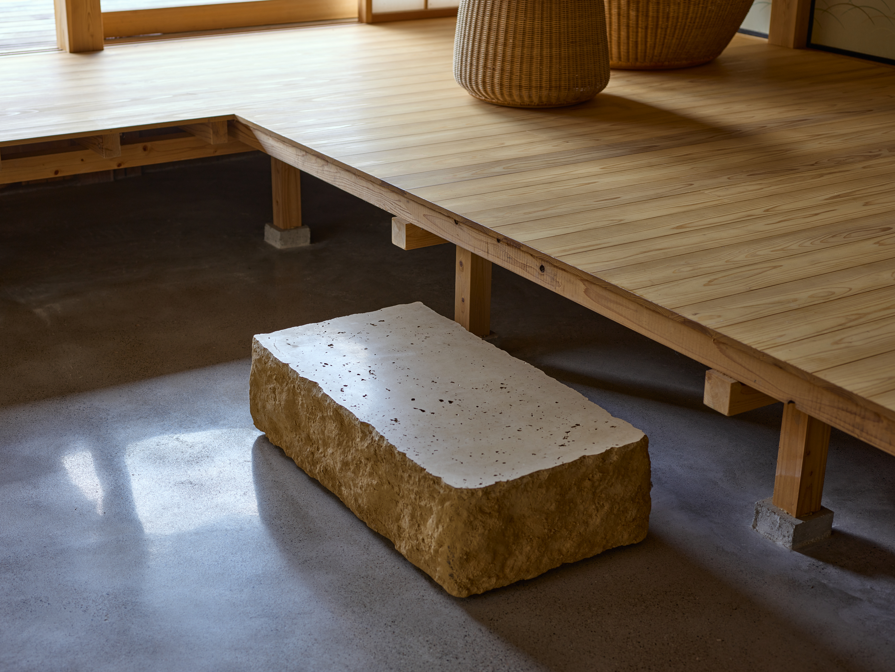
環境の一部として住宅を機能させるためには同時に厳しい自然環境に耐えうる性能を担保することも重要である。最終的には通り土間を引き入れることで減築しつつ、石床、三和土(タタキ)、縁側を要素に用いて既存の3つの建物を小規模かつ別の3つのかたまりとして再構築した。異なる空間の質を持ち込むことで外部環境と、内部環境が、解放しながら混じり合う。大きな屋根の下で建物単位を分割したことで厳しい自然環境から守りやすくもしている。「新しい使われ方」を意識しながら構造のジェネレーションを尊重し、これからの世代を守る新規構造部材や転用部材を慎重に決定した。石の間・土の間・木の間と名付けたこの新しい3つのかたまりは、通り土間や石や木について、素材の存在や配置や形、それが敷地全体に生み出す重力やバランスを考えながらスケールやディテールを丁寧に設計している。庭を作るように各かたまりの関係性を整理し、今まで使われていなかった母屋以外の建物も広々と使えるようにのびのびとした抜けを作っていった。
2018年に始まったこのプロジェクトでは、設計中に時代が大きく変わった。社会的変化と家族構成の変化に応じて、「新しい使われ方」自体も大きく変化した。そんな中で、環境建築としての農家再考と、作庭するように設計していくことにこれからの時代の可能性を感じている。場所の声や使われる建築の身体を想像し、ヴァナキュラーな気配を潜ませることで、この地に根を張ってこれからもこの場所に立ち続ける建築になっていくことを願っている。
︎記事:「生と死と住宅について」はこちら